Appearance
Images
Best practices for images.
Optimization
Let's have a look on some good practices to help display images efficiently.
Image format & Compression
Compression is the first step, relatively easy to achieve in order to reduce loading time by reducing file size, thus saving network traffic for images.
WebP is a new format for images, developed by Google, in order to add an alternative for png images, but with lossy compression, enhanced by some new techniques allowing to compress with different level selectively within the same image. As it's become fully supported in all modern browsers - it can be recommended.
You can check how much you can save by using webp format instead of others raster-images formats. See how can it help you on Thumbor.
Test different formats
There are many image formats, which have different advantages, depending on images purposes. Probably you don't need webp files for vector images. Sometimes, when the high image quality is important, using lossy formats may not be a good idea. It always depends on the use case.
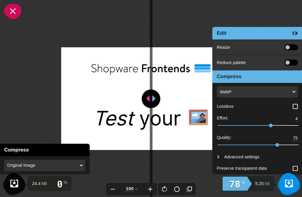
There are many tools to check different image formats, but the great one is Squoosh which allows you to experiment with images interactively:

Images hosting on CDN + Image processor
Using Content Delivery Network platforms (CDN) helps to reduce network distance, by serving resources from the closest server for an user.
Although it can be a standalone service, some platforms serves images with additional option of resizing on the fly, or being more general: processing the images, depending on provided query parameter, like ?width=400px. Thanks to this, <img> element is more readable.
html
<img
  src="https://images.swfrontends.com/frontends-unsplash.png?width=400px"
  srcset="
    https://images.swfrontends.com/frontends-unsplash.png?width=400px 320w,
    https://images.swfrontends.com/frontends-unsplash.png?width=800px 720w
  "
/>
Examples of open source image processors which can be used as a middleware to serve processed images:
Responsive images
Utilize srcset attribute for <img> elements in order to load the image in size what is actually needed at the moment. Decide what metric (pixel ratio - DPR or width) is more appropriate for your users when defining breakpoints.
Also, consider using sizes attribute which will indicate what image size is best to choose - if your images occupy less than 100% of viewport. The value can be defined in percentage of viewport width (sizes="80vw") or fixed value (sizes="600px") regardless the device size. Read more at mdn web docs.
html
<img
  sizes="50vw"
  srcset="
    frontends-header-xs.webp  600w,
    rontends-header-md.webp  1200w,
    rontends-header-xl.webp  2000w
  "
  src="rontends-header-xs.webp"
  alt="..."
/>
<!-- src fallback is set to be mobile first -->
If you application serves many image formats and there is a significant part of users with older browsers, you can use picture element.
In this example, browser will decide which image format is available to serve, otherwise the <img> will be picked as a fallback.
html
<picture>
  <source
    type="image/avif"
    srcset="
      https://images.swfrontends.com/frontends-unsplash-320.avif 320w,
      https://images.swfrontends.com/frontends-unsplash-720.avif 720w
    "
  />
  <source
    type="image/webp"
    srcset="
      https://images.swfrontends.com/frontends-unsplash-320.webp 320w,
      https://images.swfrontends.com/frontends-unsplash-720.webp 720w
    "
  />
  <img
    src="https://images.swfrontends.com/frontends-unsplash.png"
    alt="Logo Shopware Frontends"
  />
</picture>
Reduce Cumulative Layout Shift (CLS)
When Images occupy a big amount of space on web pages, they are a common cause of high CLS scores.
- Always set
widthandhightattributes for your<img>elements, with values matching size of image source. So even if they are being loaded, the space of layout will be filled out. - Define CSS style to override
<img>attributes (there is a moment when image element is available in DOM, and CSS is not loaded yet):cssimg { max-width: 100%; height: auto; } - Try to use low-quality placeholders (based on svg, for example) to avoid having empty blank spaces within the layout:
Speed up Largest Contentful Paint
"LCP element has an image on around three quarters of pages" says the result of Web research. Moreover, on 70.6% mobile pages, LCP element has an image. On desktops, the rate is even bigger: 79.4%. So we can assume, that bad LCP scores are based on low image performance.
- Never use
loading="lazy"on<img>elements if they are part of what an user see first on they viewport (consider editing the attributes for CMS elements in Shopware Experiences). - Utilize
fetchpriority="high"on<img>also tells the browser, that the asset (LCP resource is prioritized) is important and should be taken care of as fast as possible.
Resources
Collection of useful blog posts and articles about performance related to images.